This is an overall comprehensive guide for beginners on how to use Substance Painter for the sole purpose of painting textures for your creations. Lessons here can obviously be applicable outside of League skins, but this will specifically be geared towards that workflow.
¶ Required Tools
- Maya 3D Modeling software
- Adobe Substance Painter 3D texture painting software
- Nvidia Texture Tools or Intel Texture Works To export as .dds format
¶ Written Steps
¶ Prepare the model for Substance Painter
1.
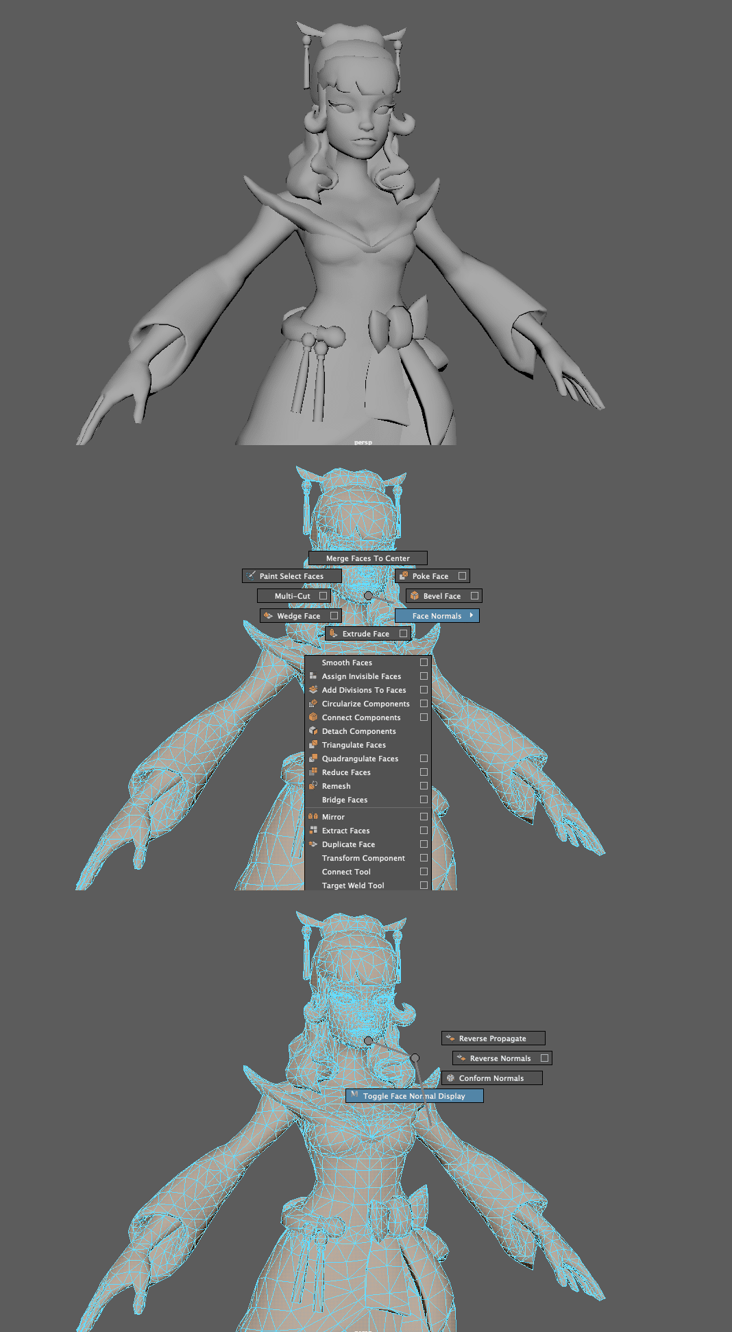
The first thing we need to do before we even open the program is to make sure our mesh is ready. All normals must be facing outwards.
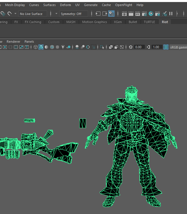
In Maya, to check our face normals, select your object in face mode and then hold right click + shift and drag your mouse to face normals > toggle face normal display. If your normals are flipped correctly, you should see the green sticks facing out from the faces. If your normals are reversed you will likely see small green dots or nothing at all.
If your normals need to be reversed, go to mesh display > reverse.
2.
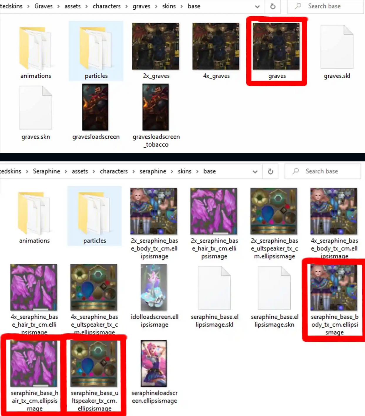
Our entire model must also be one material. You can set different materials for different parts on the model as you like, however you will need to combine the textures in a photo editing software such as through Photoshop or Gimp equivalent after you have finished painting.
Sometimes it isn’t necessary as some champions have more than one texture set.
Base Graves for example only has one for his model so I would use one material and get one texture file on export.
Seraphine however has three textures: one for her entire body, separate one for her hair, and one for her ultimate’s speakers. So with Seraphine I will have three materials set accordingly in my 3d program and I will get three texture files when I export.
You can always add more than one material via the champion’s bins.
3.
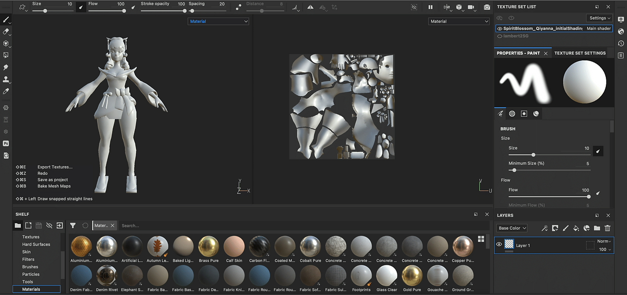
When you open Adobe Substance 3D Painter and start a project with a new FBX (for multiple materials) model, you get both a 3D and 2D view (UV).
On the top right of your screen you should see something that says Texture Set List. This is where all of your materials will be located. In most cases you will only need one but some champions have two or more as stated in step 2 on PREPARING THE MODEL FOR SUBSTANCE. You can hit the eye to toggle visibility on each material.
You will also see Properties which is where you can adjust your brush texture and other attributes. This can also be found on the top left of the UI for ease of access. And then there’s “Layers” which is self explanatory.
Interface will differ depending on your version of the program - the version in the pictures is older.
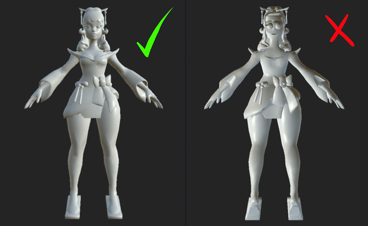
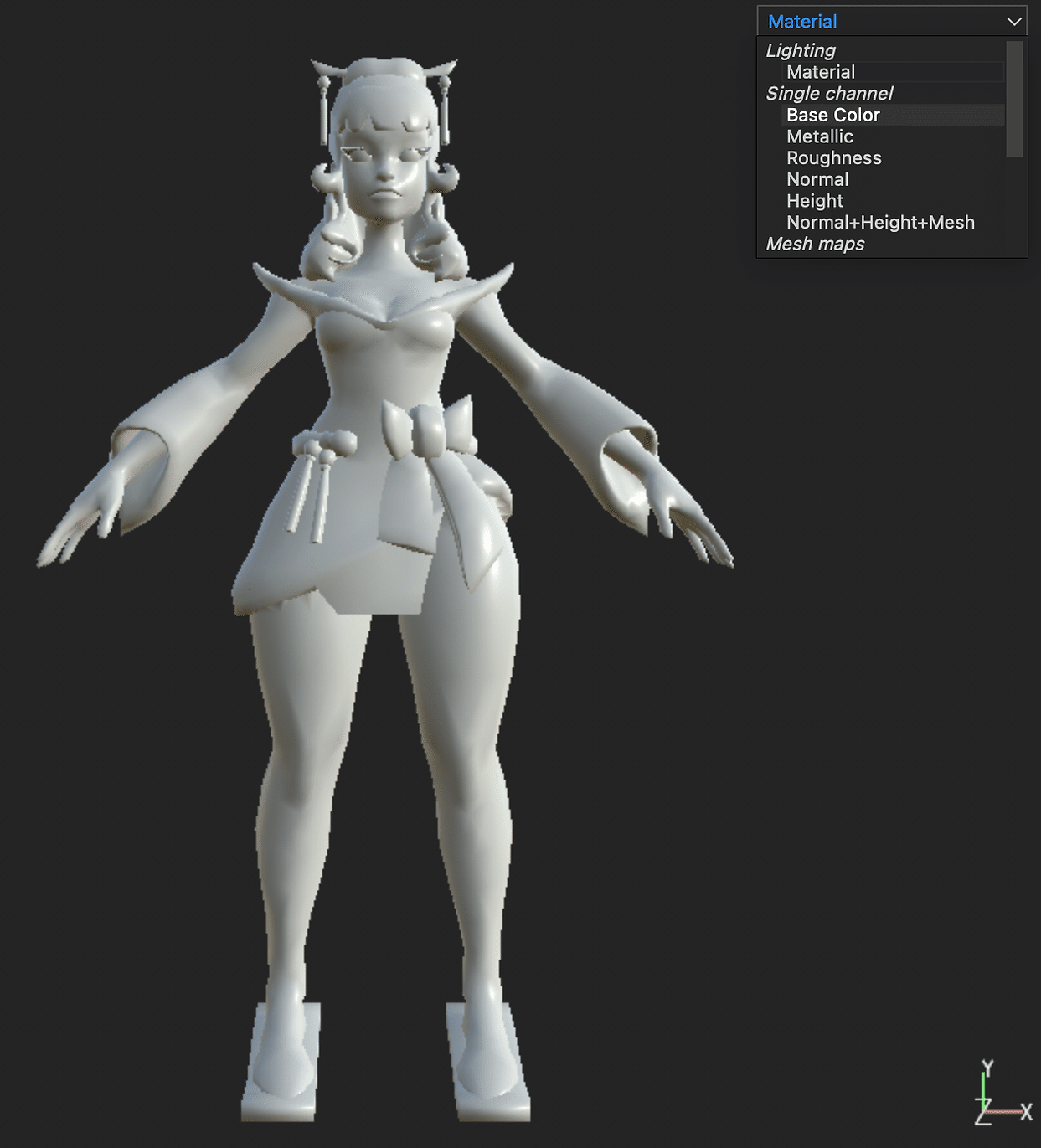
- If your model’s faces are correct, it should appear as it does on the left picture. If your model or specific faces are flipped such as in the image on the right, then you must flip those faces in Maya (or other 3D software) and update the model in Substance (
edit > project configuration > select > [updated mesh] > OK).
- Click on the tab just above the model where it says
Materialand change it toBase Colorsince that is all that League uses.
- You usually want to work with
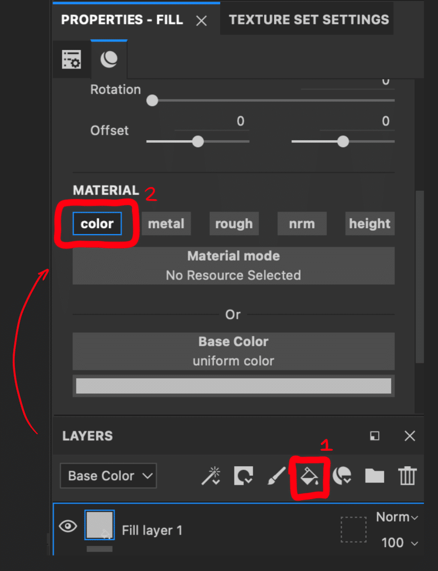
filllayers as opposed to just jumping in and painting (much easier when making chromas or editing certain clothing pieces). Create a fill layer by clicking the bucket and your model will appear with that color. Make sure to only havecolortoggled (alt + left click on color to disable everything else except what you click)
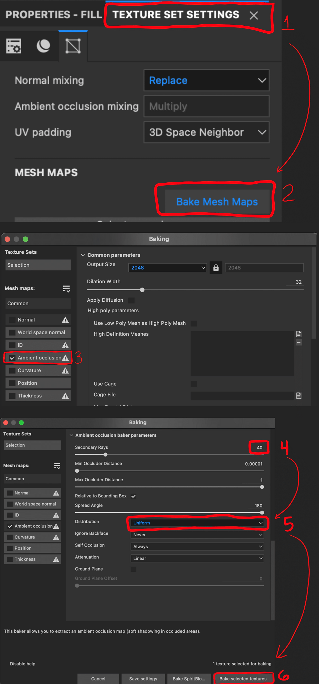
- (Optional step 4) The next step you want to do is bake the Ambient Occlusion map (AO). This will essentially create shadows for your mesh and will make your painting process significantly faster. Go to
Texture Set Settings, and hitBake Mesh Maps.
Change your output size if you would like and then selectAmbient Occlusion.Change Secondary Rays to40, with Distribution toUniform. Then bake it.
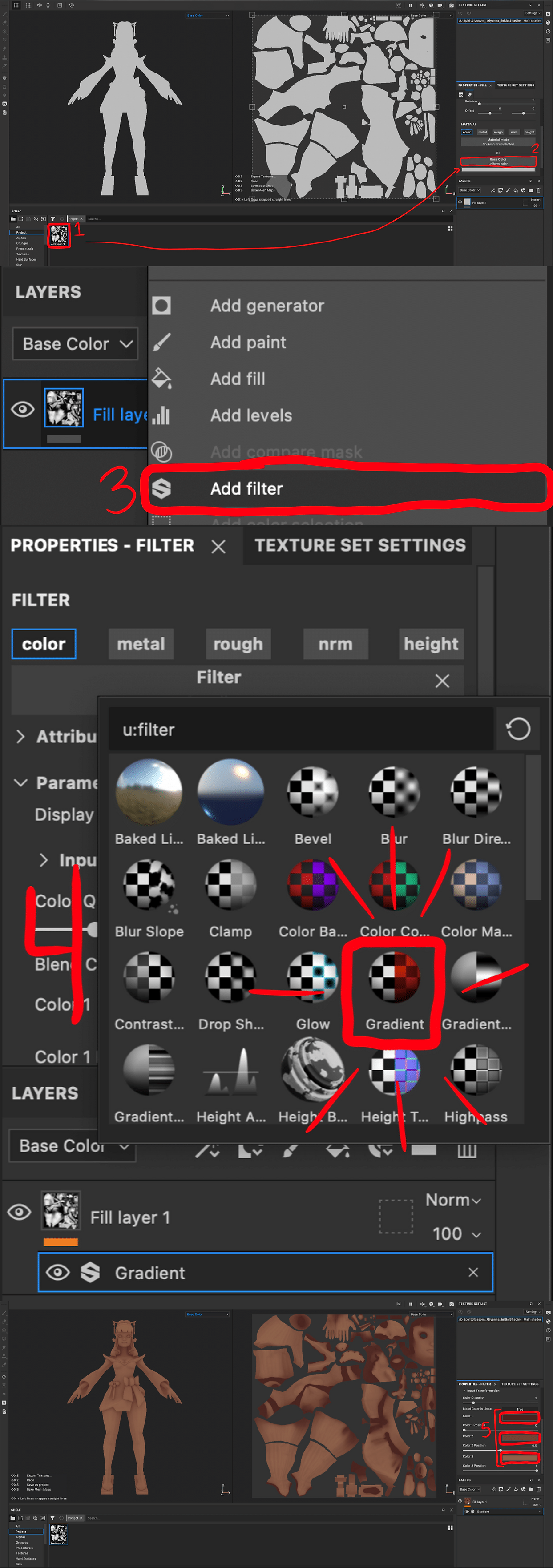
- (Optional step 4) Drag your AO texture under the shelf project onto the
base colorof your fill layer. Then right click on your layer and clickadd filter. ChooseGradientand change the colors as you want. (Starting with the skin as the first layer is what I usually do).
- (Optional step 4) Add another filter to your fill layer and choose
blur. Setting it to0.5usually works best but you can adjust it as you need. You can see here what the texture looks like with and without the blur.
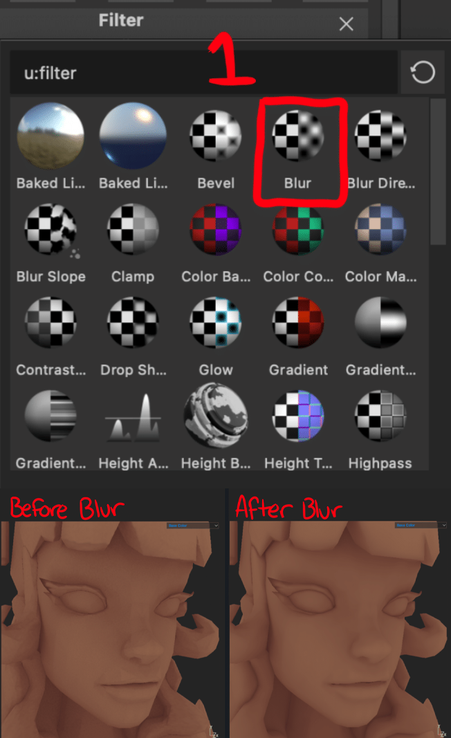
If some parts of your model appear black and it doesn’t look right, see AMBIENT OCCLUSION BAKE FIX (WITH MAYA). If you don’t mind it you can just proceed.
- Now that you have your base down, you can now add a paint layer by right clicking and adding it onto your fill layer. You can change the color of your brush and begin painting.
Tip:
- As a general note, when you are painting in the 3D view, I recommend setting your brush alignment to
cameraand size space toviewport. When you want to work in the 2D view or paint within the UVs, change the brush alignment toUVand size space totexture.
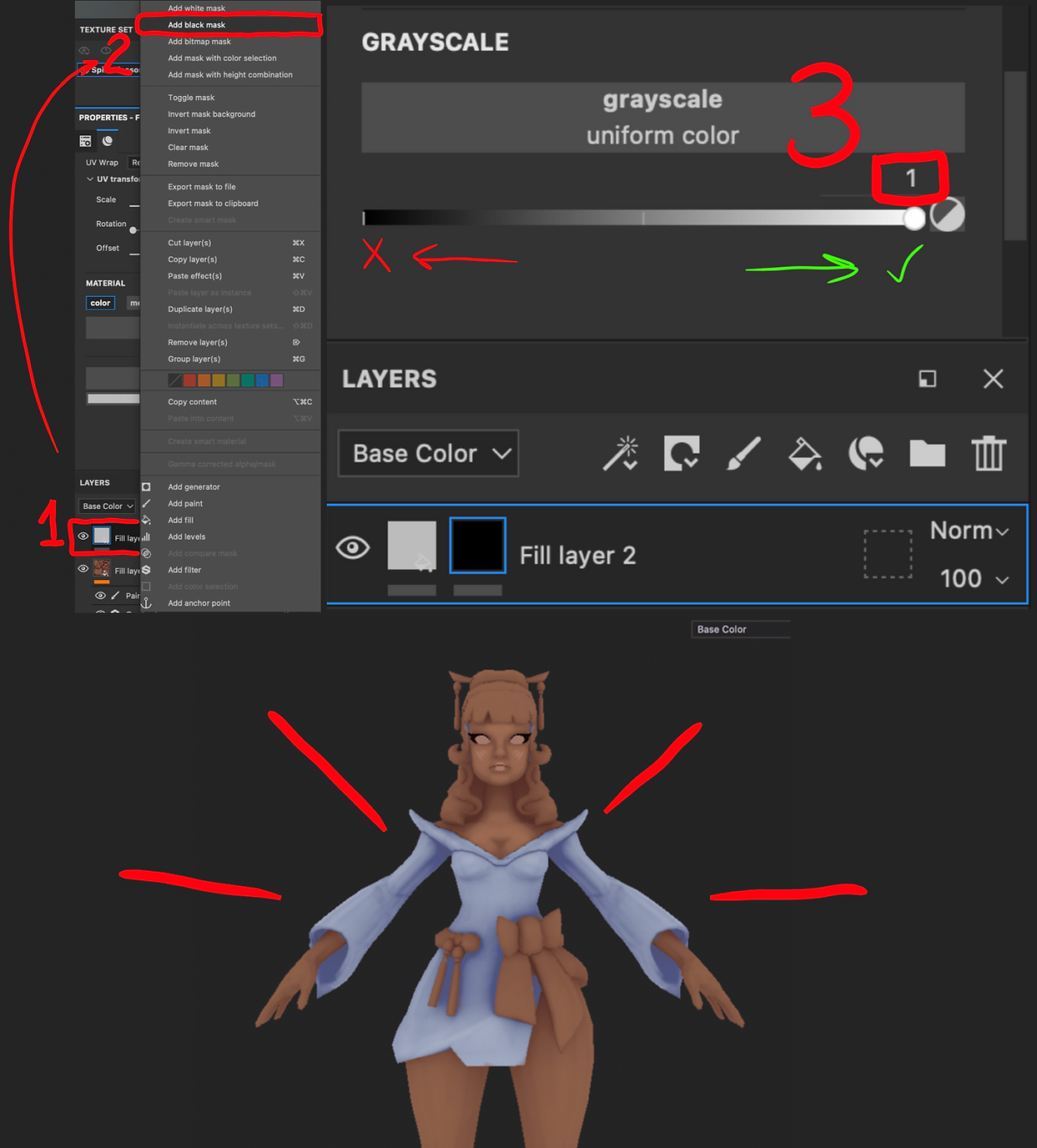
- Adding another layer to paint the dress for example is essentially the same process however, this time you will add a black mask to your fill layer. White color is to paint, and black is to erase.
Now you can paint the areas that you want for the dress. In this particular instance, I would add another layer for her bow, the rope around her waist, the hair, etc. I essentially keep things with the same colors on the same layers.
¶ Exporting
- Once you have finished painting go to
File > Export Textures. Click on your material name and deselect everything but the base color. When it states the export is finished, go toOpen output directoryand you will be directed to the location of the texture’s export.

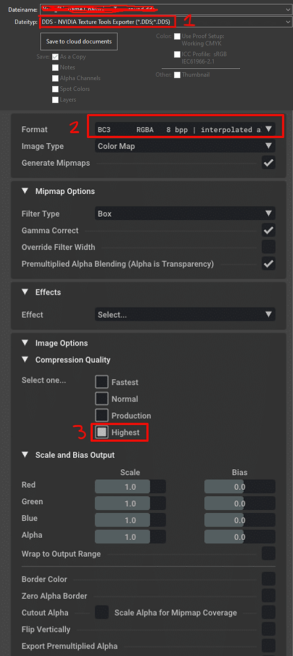
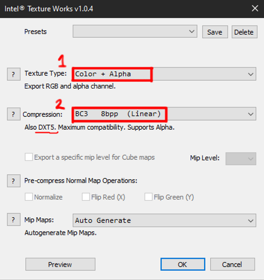
You will need to convert all textures exported to DDS as your final output into the game. If you are using Gimp, you will not need a plugin, however if you are using Photoshop, you will need to get either Nvidia Texture Tools or Intel Texture Works. Nvidia only works with Nvidia graphic cards. Listed below are the settings for each export.
¶ Nvidia Texture Tools Export Settings
¶ Intel Texture Works Export Settings
¶ Tips
¶ Ambient Occlusion bake fix
Sometimes when you bake your AO map onto your model you will get a black or dark AO, and no matter what you do to the color it still doesn’t have enough contrast for the ideal amount of control.
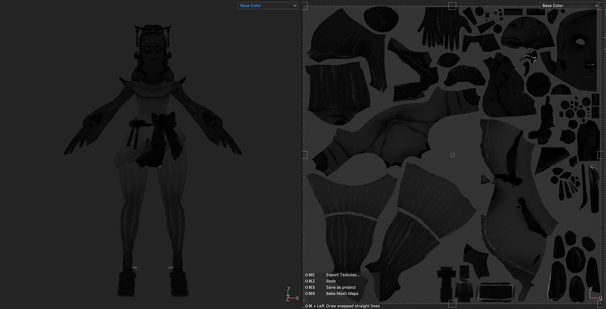
This commonly happens when you take model parts and pieces from the existing skins and champions from League. It will happen if your normals are flipped the incorrect way. If you have them flipped correctly however, this can still happen. You can easily fix this easily through Maya.
When you bring your model in Maya you want to first reverse your normals AND then hit set to face. Your model should appear white like normal. From there you can soften edges and that’ll help get rid of polygonal faces in your bake.
¶ Importing textures to your scene
You can import textures to your scene which is especially useful when you are reusing a champion’s face from their best skin. You can only import regular image formats like PNG or JPG. DDS will NOT work.
Go to file > import resources > add resource, then select your image/texture file and change the file type to texture. Import the resource to your Project. Now you can create a fill layer with a mask and paint where you want the face and make your edits!
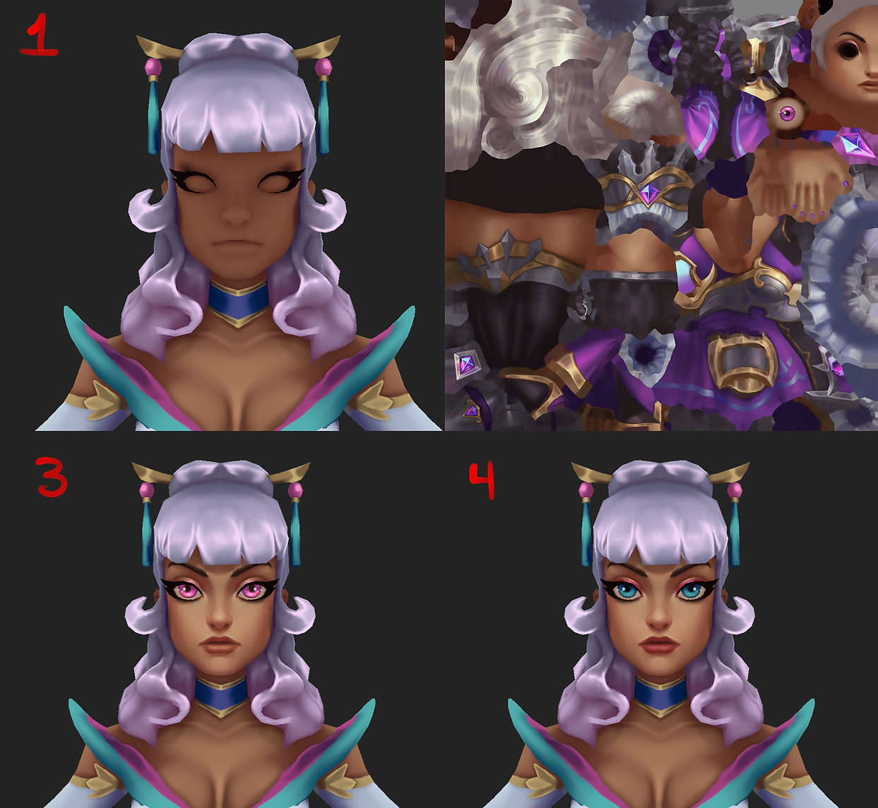
You can also export your entire texture when you are finished and then reimport that texture so that you have everything on one single layer. Very useful for repainting areas like hair where you want to do a lot of smudging on top of what you’ve already painted.
¶ General painting tips
¶ Paint on higher resolution
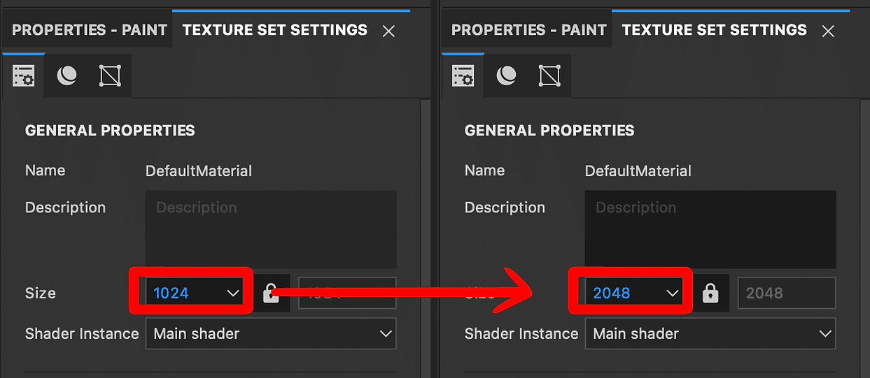
Always paint at a higher texture output than you plan to export, at the very least double the original texture size. Most League textures are at their highest at 1020x1020px. That means you want your texture output to be at 2040x2040px or higher at 4096×4096 (only IF your computer can handle it). You can always downscale in Photoshop or Gimp equivalent later.
EVEN IF A CHAMPION’S ORIGINAL TEXTURE IS 512×512, ALWAYS MAKE YOUR FINAL TEXTURE 1024×1024.
You won’t break the game, trust me. Every champion needs love, especially the older ones, so their textures should be the exact same sizes as their newer skins and champions. Be mindful that all textures must also be converted into a .DDS file format.
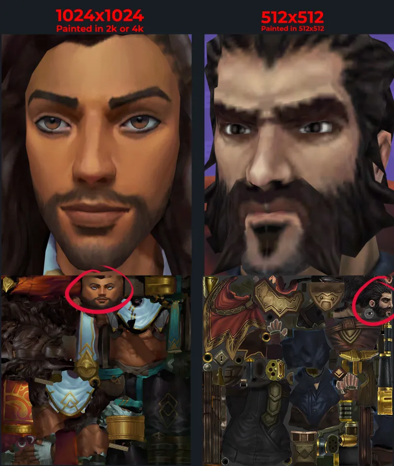
To show you just how important painting at higher resolutions can be, take a look at these comparisons between textures. Graves being a pretty old champion has yet so receive a visual game update so his texture is quite rough in comparison with a newer champion like Akshan. Older champions tend to have 512×512 as their base textures which is usually very bad especially if they have a lot going on in their meshes. Graves has a cape and his entire gun so it’s a lot to squeeze onto a UV map but it’s also a 512×512 texture painted directly at that same size, so you can very easily see the pixelation.
Akshan on the other hand has a 1024×1024 texture and was likely painted in 2048×2048 or 4096×4096 before downscaling for the final in-game output. You can tell this because you can just barely make out any pixelation and the transitions between light and dark values is very clean. They both have roughly the same amount of space allocated for their face textures but somehow Akshan looks better, and that is because his texture was downscaled. Downscaling will always cause some degree of pixelation but it is very important to be at a higher resolution during your painting process to make sure as much of your work is salvaged.
Zoe’s final texture output for her body is 512×512. Even though she is newer than Graves, she actually has a separate texture for her hair as well, so rather than cramming her hair onto her body texture as well, Riot decided to make a separate texture file. 512 + 512 = 1024, so the division between two texture files makes sense. In her UVs everything is adequately sized to about the same to make sure they all get an even amount of resolution. You can also tell that she was not initially painted in 512×512 but rather downscaled after which is why she looks better than Graves. It helps that her face is quite large in the UVs in comparison for sure, but painting at a higher resolution before downscaling also plays a vital factor.
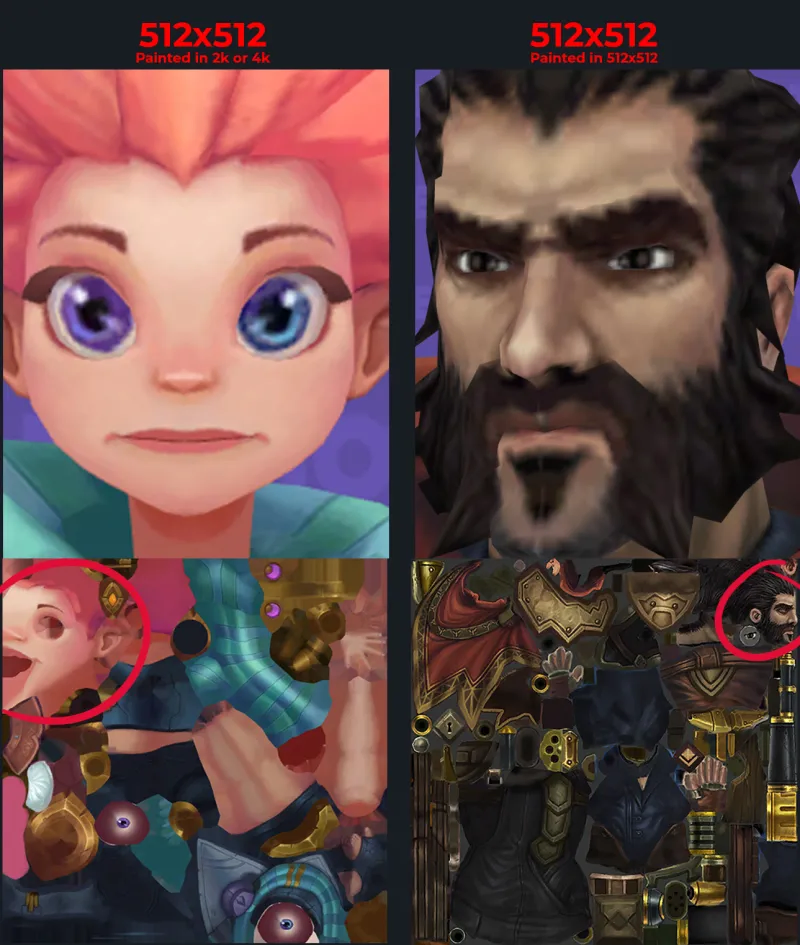
Always Remember: You can go big to small, but not small to big. This is in reference to your texture output. It's always better to work from a higher resolution when painting the textures instead of a small texture resolution.
¶ Combat extreme lag
Sometimes you may experience extreme lag when painting. Make sure on your brush properties that you only have color toggled.
¶ Get the right lighting
Generally, League has lighting that is top-down, so you want to paint your shadows as such. Baking your AO map is very important as it takes care of where the shadows generally are. Underneath the arms and on the sides of the body for example and on the inner leg. Sometimes these details are missed by beginner eyes, so baking the AO helps to take care of that with ease.
Here in this diagram you can see a very simplified example of how this lighting works. As we move towards the legs, there will be more darkness and less contrast between highlights and shadows. Pool Party Jarvan is a fantastic example to look at. The closer the body is the ground, the less contrast there will be between lights and darks. As you travel up, there will be more contrast.
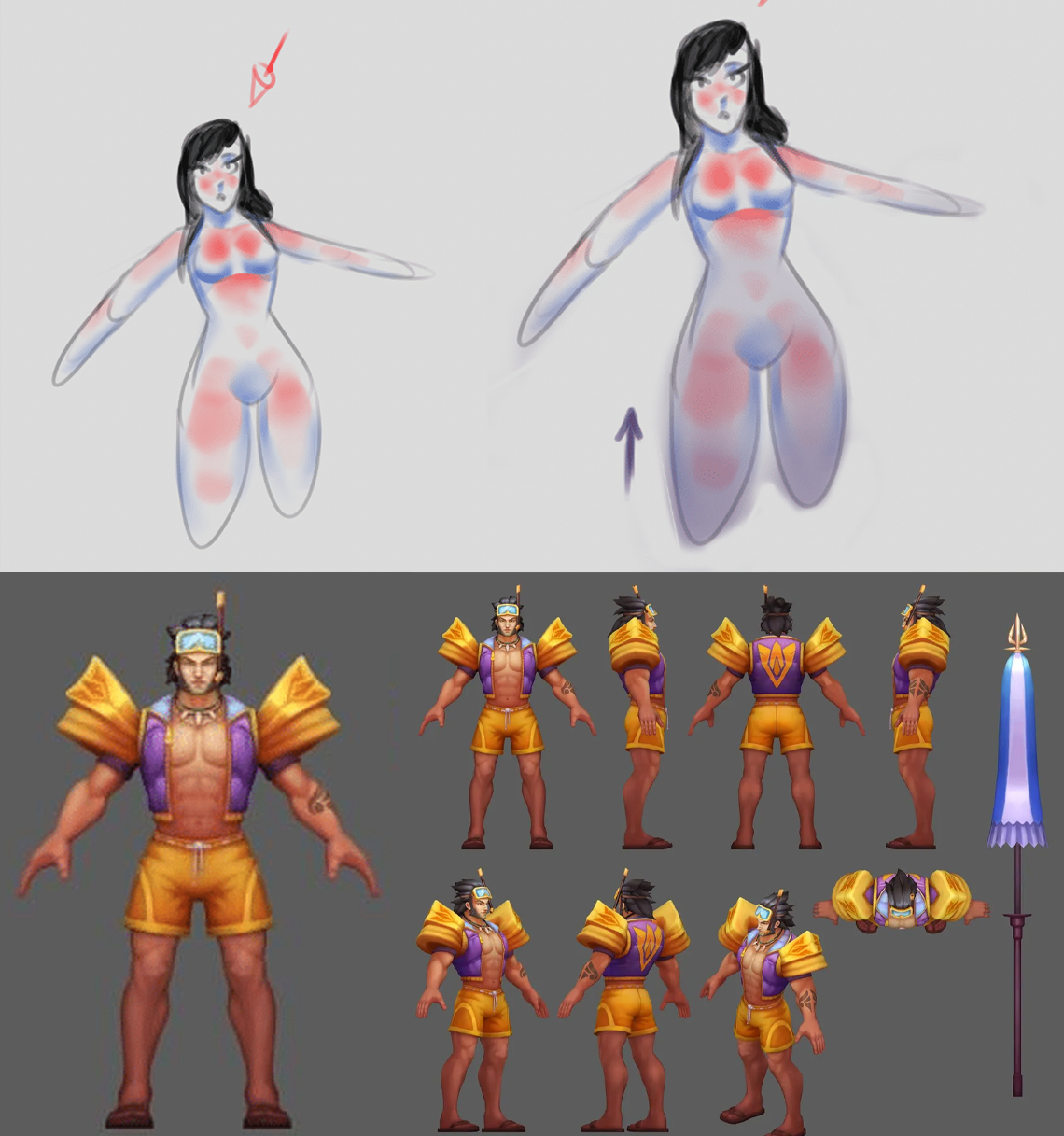
You must always keep in mind the top-down lighting that League has. You will always have a dark gradient traveling upwards. Without this, champions can appear flat in-game. The farther their body is away from us, the darker it gets!
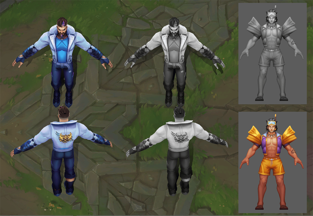
Take a screenshot of your champion in Maya and place them in a test scene against a Summoner’s Rift background with both a color and grayscale to help you visualize what needs to be done.
Sometimes the values can differ depending on what you are comparing to. Darker colors will obviously be darker in value, so you have to be especially mindful of gradients in those. Lighter colors are usually easy to catch issues in. In this example of Graves, I plan to make a darker purple color for the lower half of his jacket to help with giving a more convincing lighting situation.
¶ Get skin color right
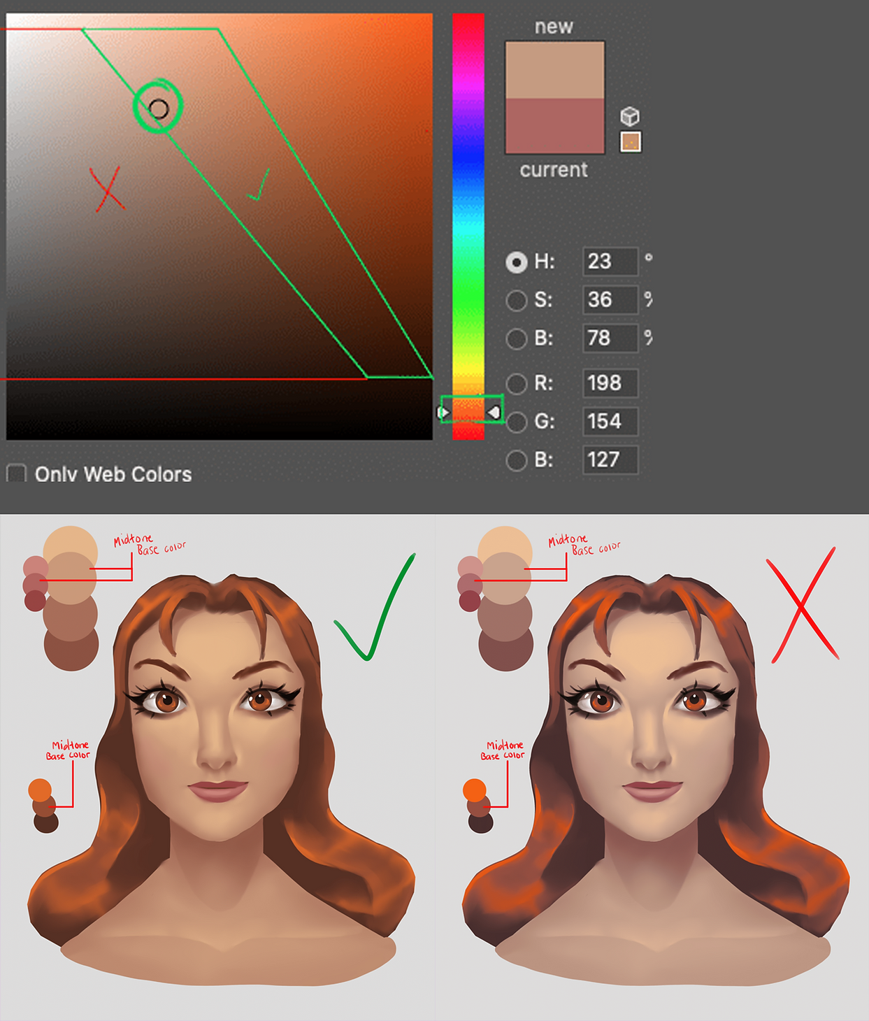
Usually as you go darker you also want to saturate and push more towards a colder hue like purple or blue. As you go lighter, push your hue slightly more towards a warm color like yellow.
It is especially important to keep this concept in mind as you paint skin tones because it’ll help to make the skin feel alive and colorful while also keeping away from making it look muddy. Pick a level of saturation for your base mid tone color and push that color down and right with a shift to red to go darker or up and left with a shift to yellow to go lighter. You can see this in this example that I have painted.
¶ Get the right shadows
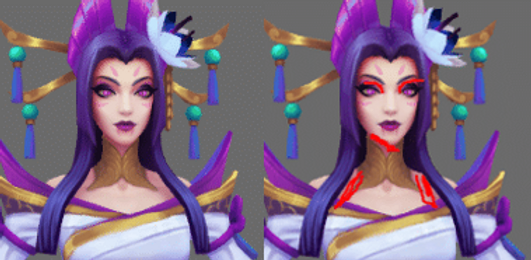
Cast shadows from top down will be casted such as under the nose, on the neck, and where other objects such as hair may sit above or overlap another like a skirt onto legs.
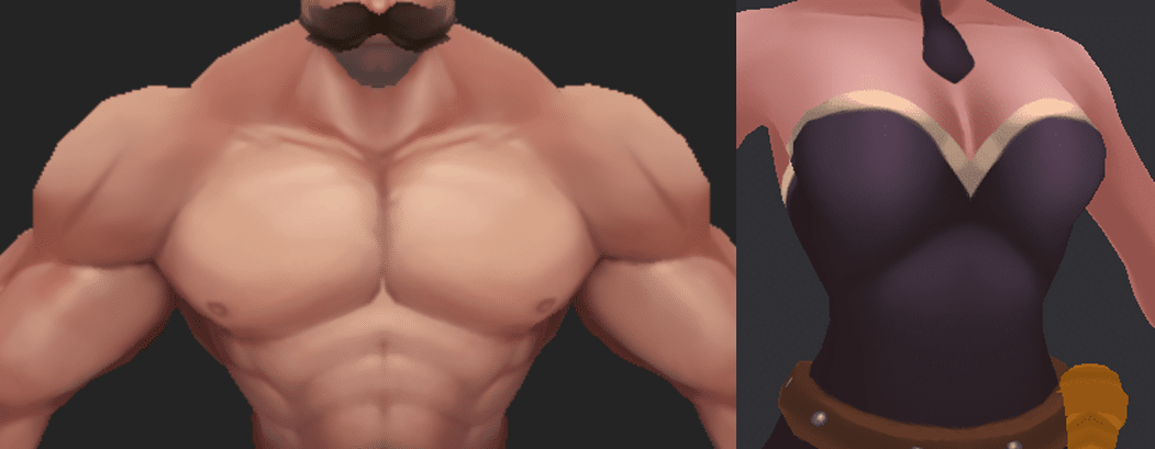
Here are a couple of great examples of how lighting affects the torso for males and females.
Males will generally have much harsher transitions, especially if there is bare skin as muscles have defined crevices and edges.
Females on the other hand are the opposite as their bodies are generally much softer and transitions are smoother. These can obviously change depending on the champion’s gender and level of strength. Keeping the champion’s integrity however is always recommended.
There can be exceptions to "Get skin color right" as there are some champs with darker skin tones that have green highlights as opposed to yellow like Senna, or there are champions from the Shadow Isles who have the same green or even blueish highlights like with Gwen who has very pale skin.
Desaturated skin tones like Viego indicate death or less health and well-being. This can also be seen in the Ruined skin line in Karma and Draven.
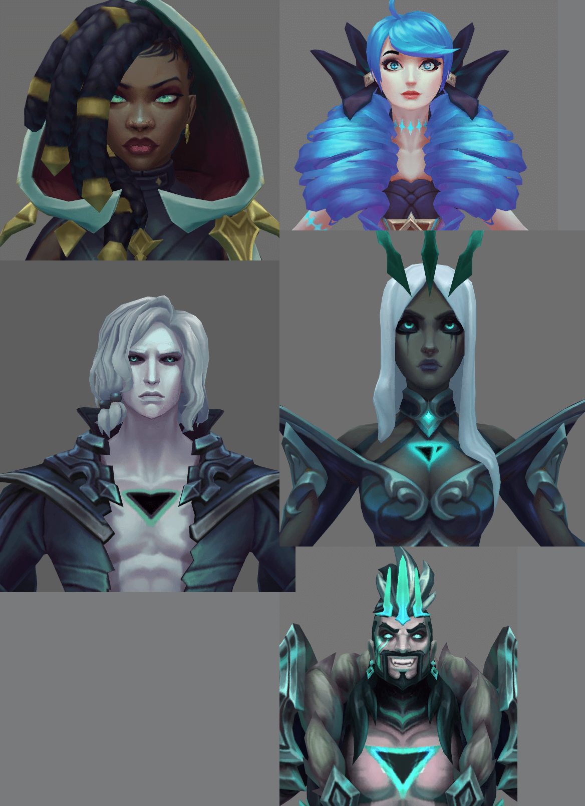
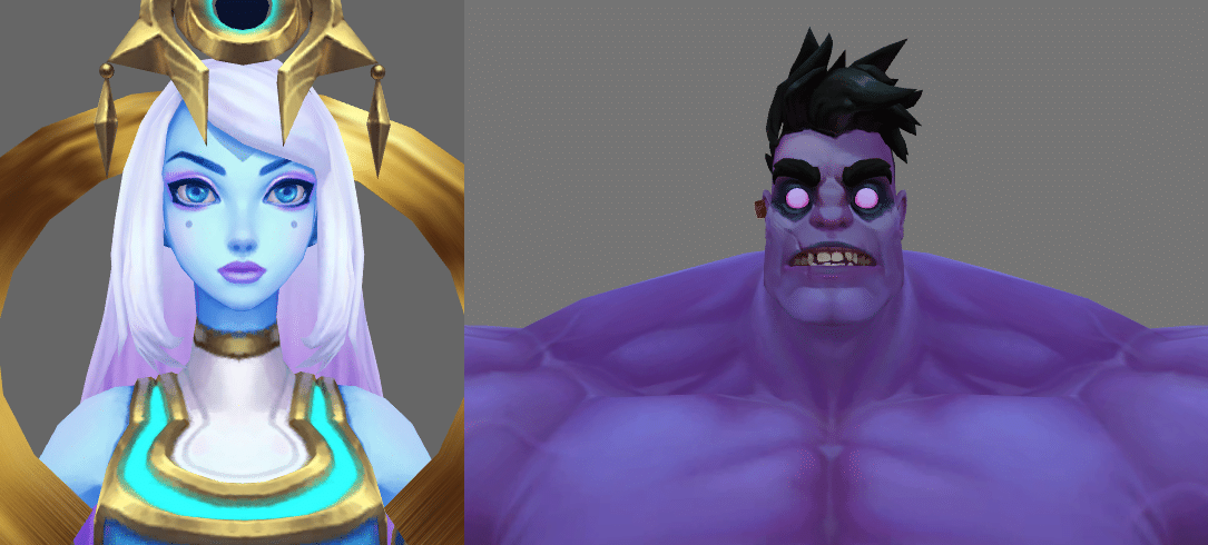
Other champions have completely unique skin tones such as purple or blue like Mundo and Cosmic Lux. You can still see the same concept of more yellow being added to the blue color for Lux on her lighter highlights. And Mundo on the other hand has more blue since his skin is unnatural. These are things to look out for as you use League skins as references for your painting.
¶ Painting in black and white
You should also try painting in black and white then using the gradient color filter to apply your color after. When you paint in B&W you focus significantly more on details, slight changes in values and on your edges without having to worry about color. This makes it effortless to create chromas because all you have to do is change the colors on your gradient as opposed to adding more layers with different blending modes and praying that you will get the color that you want.
¶ Use the right reference
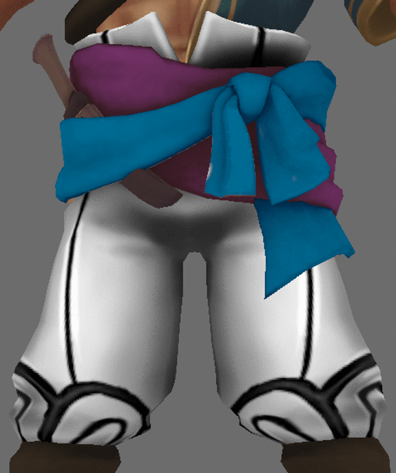
And that brings me to TIP 7 which is to always use League of Legends skins as reference for anything you are painting, especially if you want your skin to match the same aesthetic as the game. Check out Teemo.gg to view their models and use as reference.
There are plenty of great references for leather such as in Swiftbolt Varus and KDA ALL OUT Evelynn. Metals on Mordekaiser, hair in Transcended Kayle or Coven Morgana, muscles in Pool Party Braum or female forms in Evelynn, body hair in Pantheon, patterns in Spirit Blossom Cassiopeia, and many more.
¶ Brush Settings and Importing Alphas
Referring back to the tip on step 7 in WRITTEN STEPS, it is important that you are conscious of what your brush alignment and size space settings are as it can become frustrating to deal with. Be mindful that everytime you open and close your project, the brush alignment will resort back to its default settings.
An alpha is basically your brush texture.
When importing your brush texture, it’s essentially the same process as importing a texture, except you change the file type to alpha. You can create a texture in Photoshop or Gimp equivalent. Simply make your background black and your texture white.
Setting the import to shelf, shelf will basically import the brush texture to your Substance Painter shelf, meaning that whenever you open or start a new project you will always have that brush texture available in your brush alphas. The same is true for textures and any other resources you decide to import.

Smudge Tool: For smudge tool I recommend putting the flow at 8-15% for soft transitions. For smudging in areas like hair highlights to get hard transitions with softened tips I would recommend 40% and more. I would never recommend using UV as your brush alignment ever when using the smudge tool, use the Camera alignment instead.
¶ Sources
- Bearded Shepherd